

Over the years, John and John have accumulated all sorts of caricatures and avatars (and Avatars). I love the styles and sources and looks, and so here I have collected an incomplete list (32, currently).

It would be impossible to rank them properly, so I'm rating them in no particular order by 3 qualities: Resemblance, Adorability, and Grotesquerie. I would like to note that none of these three qualities is valued over the others. It's all a matter of taste.
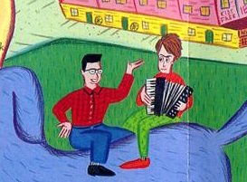
Resemblance: 4/10
Adorability: 6/10
Grotesquerie: 4/10
The very beginning. The first of many artists baffled by JL's hair, Greenblat is going absolutely wild with those colors & textures. (I wish Linnell dressed like that in real life.) The vibrancy, the expressions, the poses: They exude personality.

Resemblance: 2/10
Adorability: 12/10
Grotesquerie: 0/10
Simplistic little men with the MTV-era hairstyles. An example of the classic Glasses John and Hair John caricature dichotomy. They have such lovably vacant faces. Do they know they're perfect? Probably not—their wide, empty eyes make me suspect they aren't capable of sentient thought.
It strikes me as slightly odd that JF's scientist outfit here has a bow tie. Not actually unheard of for him, but certainly strangely specific. Maybe a nod to the "bow tie and thick glasses" nerd archetype?
(Ana Ng reshoot) (With the Dark) (as scientists) (with camera) (tootsie hats)
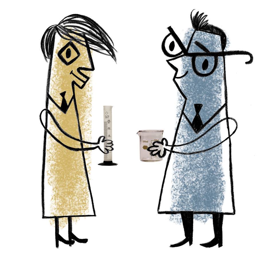
Resemblance: 7/10
Adorability: 9/10
Grotesquerie: 4/10
Friendly. Geometric. Color-coded. Midcentury-inspired. Stylized to the point of abstraction, yet still functionally recognizable. Spiffily dressed for science-ing. What's not to love? First, they should investigate how JL's hair manages to defy physics.
(HCS bumper segments) (Satan is Real tribute cover)
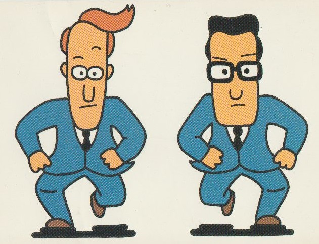
Resemblance: 3/10
Adorability: 3/10
Grotesquerie: 0/10
Doesn't score particularly high in any regard. They seeem to be designed more for internal consistency than specific resemblance, like the design choice to make JL out of ovals and JF out of rectangles. The style is a rather generic cartoon look meant primarily for animation. Artists definitely put Them in matching suits/ties more than they actually wear them.
(music video)

Resemblance: 3/10
Adorability: 6/10
Grotesquerie: 0/10
God knows what's going on with the beehive on JL's head, but again, no artist seems to know what to do with that. For designs that are stiff and simplistic by nature, the Put it to the Test video makes them fantastically expressive (grok the face JF pulls when JL coughs up a plant at 0:52). The stylized text in this gif is a cool and understated additional way to capture each of their personalities. Note the "blank glasses" trope.
(Thinking Machine)
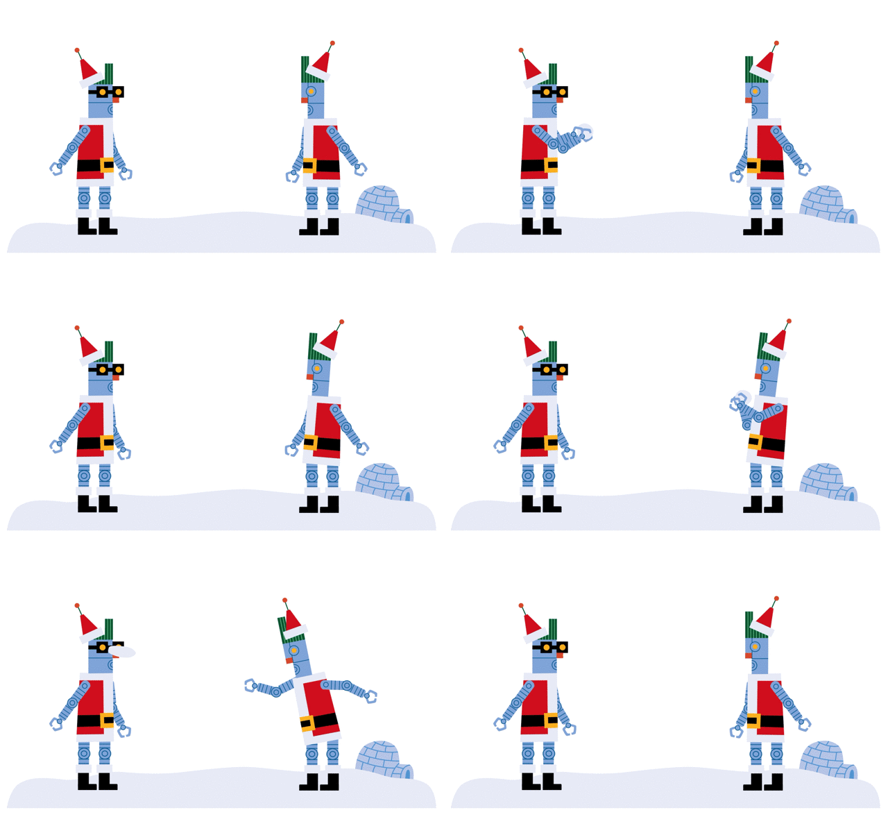
Resemblance: 2/10
Adorability: 4/10
Grotesquerie: 1/10
Disconcertingly specific. Trapped in hellish loops of passionless execution of holiday cheer. They may be soulless metal husks, but look at those funny little red noses.
(fireplace gif)
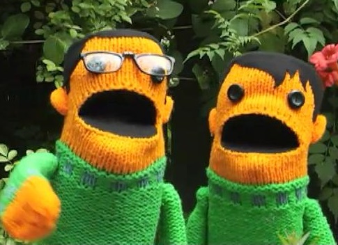
Resemblance: 4/10
Adorability: 6/10
Grotesquerie: 5/10
She's talented with textiles, but even Robin can't quite make the cylindrical heads, black button eyes and gaping black mouths not look weird and amorphous. Still, given breath by the Johns' voices, the Muppet effect of floppy bodies and odd faces suddenly make jokes aimed at children comedy gold. In fact, the way JF's (real) glasses are so badly perched on his wonky button eyes just adds charm.
(D is for Drums)

Resemblance: 7/10
Adorability: 5/10
Grotesquerie: 8/10
I'm not going to even pretend to be impartial for a minute: I absolutely LOVE these guys. Crazed colors/textures reminiscent of the Pink album unfold into 3 warped clay-and-wire dimensions. The resemblance demonstrates how Keesling's actually paying close attention to the shape of Their skulls. Creepy? Sure, but wildly creative and the first of these to get JL's hair true to life. It's an odd coincidence that their colors match those of the Here Comes Science Johns. I mean... that has to be a coincidence, right?
(As far as I know, their only appearance was on a now out-of-circulation t-shirt in 2003).
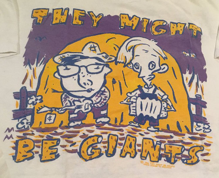
Resemblance: 6/10
Adorability: 4/10
Grotesquerie: 6/10
Expressive brushwork on those lines. Again, more attention is being paid to face shape. Don't really know where they got the freckles on JF from. Cool detail: the tag on the guitar, a recurring Chessmaster-related gag from the live show. I just wonder why they look so morose.
(JF calls this his favorite!)
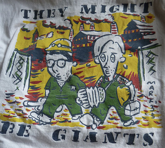
Resemblance: 5/10
Adorability: 3/10
Grotesquerie: 5/10
I almost lumped them with the Hayseed Johns, but these working-class heroes are their own thing, less exaggerated. They look pretty scruffy and worn down. Long day at the melody factory, I guess. I'm doing my best not to complain about the ways artists mess up accordions, but this interpretation is so loose that it's charming. It appears to be on a guitar strap.
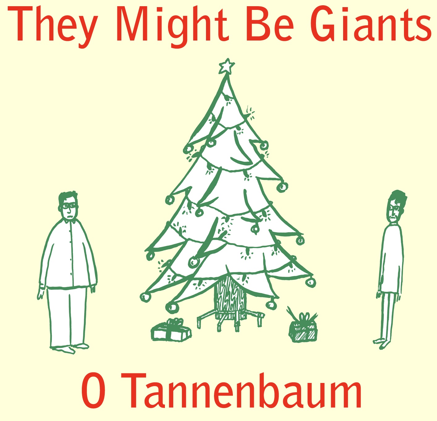
Resemblance: 6/10
Adorability: 4/10
Grotesquerie: 1/10
More brushwork, very simple yet effective. Zoom in for full appreciation of those tiny inkblot faces. Is JL wearing glasses? Is JF not? Unclear. They ALSO look morose. Come on, open your presents and maybe you'll cheer up, guys.
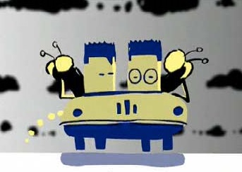
Resemblance: 1/10
Adorability: 8/10
Grotesquerie: 1/10
At least these guys are happier. I...think. They're cute at least, and seem pretty unbothered by the biblical plague of flies overcoming the land. A similar "featureless cylinders" look that made the puppets unnerving is endearing here. Our only identifying hint as to who is who is in the glasses.
(music video)
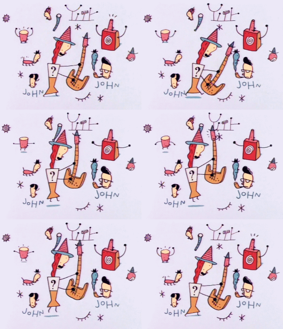
Resemblance: 4/10
Adorability: 9/10
Grotesquerie: 1/10
I like that the smoke coming out of the iconic pipe is a little man. Note JF's glasses without any eyes behind. I'm a fan of Seibold's super-simplistic dot-eyed line drawings and I can't really think of any good objective comments to make so let's just look at the DAS logo he made, which holds the exact same charm:

Shoutout to Cubertown for convincing me to bump up the resemblance stat. We all love these little guys.
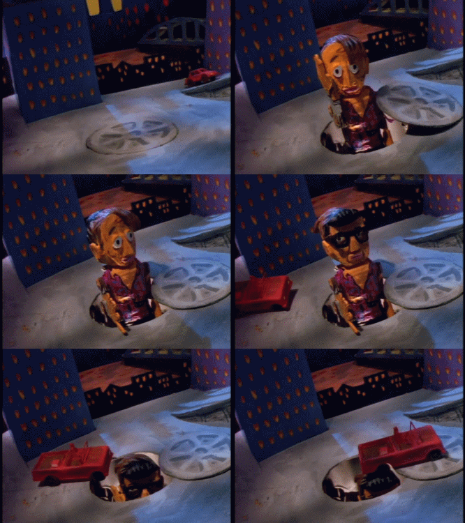
Resemblance: 5/10
Adorability: 3/10
Grotesquerie: 4/10
Whoa! I drew something like this two-faced Janus Johnster once before ever seeing this video, and I think it's a cool idea executed better here than I ever managed it. Limitations of the medium add cool angularity, but other than that these seem pretty standard as caricatures go. I do wonder about the low-cut... purple.... garment thing the Johnster is wearing though, and the fact that it seems to be Attack Of The 50 Foot Whatever-sized (a Giant pun, perhaps?)
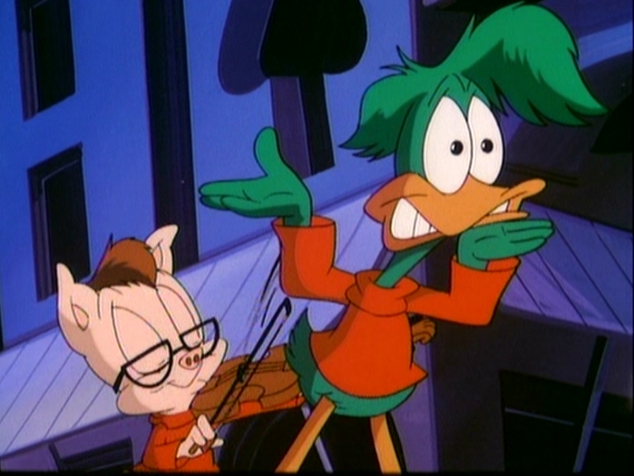
Resemblance: 0
Adorability: 3/10
Grotesquerie: 1/10
Our last Istanbul-video Johnifications. Oddly, both wear red turtlenecks, as though it's some sort of band trademark. I'll leave it at JF's words on the commentary: "There's something about being animated as a pig that keeps you coming back for less." (Though JL suggests that the violin means the pig is Mark Feldman instead.)

Resemblance: 7/10
Adorability: 3/10
Grotesquerie: 3/10
If they gave JL the physique of an action hero, JF got that of a pro wrestler. What a power stance! Those anime toddler faces don't sit well with me either. Ignore the weird style elements, though, and it's a pretty spot-on representation of 2000s-era They. Too bad that the 2010s had just rolled around and JF was already making them off-model with his new attempts at facial hair. (By the way, wait until you hear their voices.)
(cutscene 1) (cutscenes 2 & 3) (final cutscene)
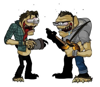
Resemblance: 1/10
Adorability: 0
Grotesquerie: 10/10
GOOD GOD! IS THAT.... a CONCERTINA? I don't think John Linnell can play concertina, unless these Rat Fink-lookin' fellows have picked up some skills our Johns haven't. At least they have their truly angelic voices going for them.
Unfortunately, I thought too hard about the terrible genesis and sad fate of these monstery dudes, who seem fully sapient, don't attack first, and sound rather upset about their appearance. You have to kill them to complete your quest, and now I feel bad for them whenever I think about them. Thanks, Adventure Quest.
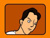
Resemblance: 2/10
Adorability: 1/10
Grotesquerie: 6/10
I know Linnell is a little lumpy, but he's not THAT lumpy. Don't like those eyes. Don't like this. No.
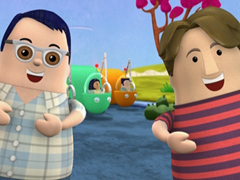
Resemblance: 2/10
Adorability: 6/10
Grotesquerie: 3/10
We're really down the rabbit hole now. This video is truly strange and dreamlike in a way that only children's media is. John L emerges from a lion, John F emerges from John L, then has a concertina (concertina, again!) pulled from his chest. I feel as tripped out as They look. If they'd only given them both the same sort of eyes, the internal consistency would make them less scary. Anyways, Flansburgh wears (well, wore) glasses for nearsightedness. That makes your eyes look SMALLER, not bigger.
(video)

Resemblance: 6/10
Adorability: 1/10
Grotesquerie: 8/10
There's something Shel Silverstein to this pleasingly offbeat ink drawing. Commissioned back in the 90s, this existential prediction is now truer to life than ever. We'll see how the next twenty years treat Them. But hey, catch me in 2040 screaming along in the front row. In the words of Bibliophilia, "I can hear the liquid gurgle of their fascia melting away right now!" What fun!
(JF reflects on this mortality-aware shirt back in 1997)
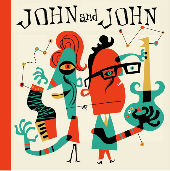
Resemblance: 8/10
Adorability: 2/10
Grotesquerie: 6/10
David Cowles?? This guy AGAIN? Indeed! And hitting it out of the park, as usual. A crazy-good grasp of shape and form with brightly imaginitive colors. I honestly like it more than the album cover that it's an homage to. The only thing that gets lost is that because neither guitars nor accordions have obvious melody-outlets, you can't tell that the dots and lines are meant to be the notes coming out. (Something funky is going on with the instruments—the guitar is a lefty, but held upside down in a right-handed hold, and the accordion is backwards. Maybe it was originally drawn flipped?)
Resemblance: 10/10
Adorability: 3/10
Grotesquerie: 7/10
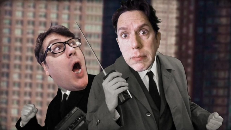
Yes this counts, because I say it does. More formalwear! I've seen photo-cutout style illustrations like this before, but never in motion. Interesting, and unnerving, but intentionally so. There's something uniquely TMBGish to the color photos of their faces pasted on the black-and-white bodies.
(video)
Resemblance: 1/10
Adorability: 6/10
Grotesquerie: 0
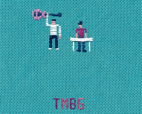
Hine returns with some cool monsters and some very tiny Johns. Note that Linnell's on keyboard, a more honest (if less iconic) choice. This is our first JF with no trace of glasses: just the guitar indicates who's who. The blockiness is reminiscent of the pixel Johns, even if they're much simpler; it even retuns to representing JL's hair with an absurd column atop his head. Alas, the stitched Johns do not survive long before their death at the hands (pincers?) of a Lakemon.
(video)
Resemblance: 10/10
Adorability: 3/10
Grotesquerie: 3/10
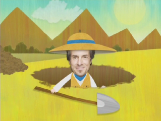
Hello Danny! This is kind of the same concept as the Icky video, but with animated bodies. Whether that makes it more or less weird is in the eye of the beholder, I suppose, but I like it. Plus, the whole band gets an appearance, which is a notable first here!
A cool note about this is that Sean McBride was a long-time TMBG fan who approached the band with his animation reel through MySpace. He'd been into the band for a LONG time, though, as evidenced by this fan animation for Minimum Wage which he did ten years prior.
Resemblance: ???/10
Adorability: ???/10
Grotesquerie: ???/10
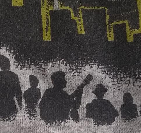
My favorite TMBG t-shirt has this tiny cameo! Very subtle silhouettes, you could almost miss the accordion. I have no idea why Linnell is wearing a hat.
(TMBG t-shirt blog post)
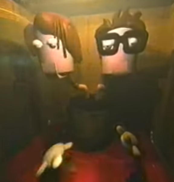
Resemblance: 2/10
Adorability: 1/10
Grotesquerie: 6/10
This may be controversial, but I like this. It has the iconic early 00s 3D animation feel, which meshes oddly well with the fact that it's supposed to be some fortune-teller right out of Marvin's Marvelous Mechanical Museum, complete with the hinged ventriloquist jaws. This is neither the first time or the last that They will be depicted as one fused entity. This list has seen some absurd attempts at Linnell's hair, but this version, with its weird hair-fingers, has got to be the most egregiously dumb.
(video)
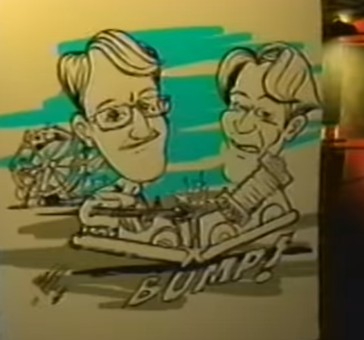
Resemblance: 3/10
Adorability: 1/10
Grotesquerie: 4/10
Continuing with the fair theme: it's the most classic fair-stand-caricature art style possible, the one with the heads three times the size of the body. I'm not a big fan of that style, but I understand why it was chosen thematically. It's only about as accurate as any of those caricatures ever was, which is to say, not very. Also we're back to the concertina and Flansburgh holding a guitar right-handed.
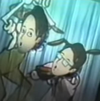
Resemblance: 3/10
Adorability: 3/10
Grotesquerie: 1/10
I didn't understand what I was seeing at first, but this also fits with the fair theme: it's one of those boards you stick your faces through. We return to the trope of glasses with no eyes behind, but other than that, it's a pretty vanilla 00s webcomic style, almost like Ctr+Alt+Del. Aside from the hair, they seem to have contracted same-face disorder.
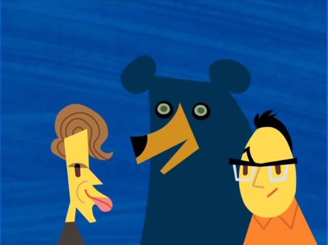
Resemblance: 6/10
Adorability: 2/10
Grotesquerie: 7/10
Wow! I REALLY don't like that! The thing is, these caricatures do everything that I liked about Cowles' Science Johns, but push it just a LITTLE bit too far past the breaking point of cute cartoony recognizability into the uncanny valley, even totally ignoring that haunted-looking bear. With more realistic colors, I become aware of their lack of ears. JF is an egg. JL seems to have a waterfowl-like bill. Did Linnell lay Flansburgh? I don't want to think about that, but too late, the association has been made. I love and respect your work, Mr. David Cowles, but all I can think of is how horrifying and tongs-like this Linnell would look if he opened his mouth.
Resemblance: 7/10
Adorability: 7/10
Grotesquerie: 1/10
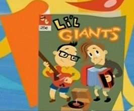
Alright, that's much better. Cowles has such a talent for capturing Them, or at least the popular imagination of Them (by the 2000s, JL sported neither a turtleneck nor the iconic floppy coif, but it seems almost illegal to forego them). I could just pinch their Li'l cheeks. I like that the greatest hallmark of youth, other than big eyes and chubby cheeks, seems to be "wearing shorts".
Resemblance: 5/10
Adorability: 2/10
Grotesquerie: 4/10
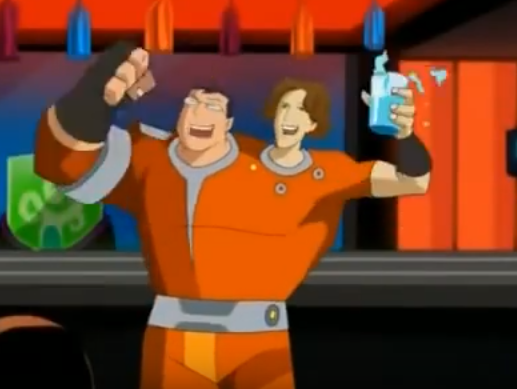
This one isn't official in any way, shape, or form, which just makes it even odder and more fascinating to me. This is a 2-second background character cameo. John and John didn't voice them. There's no TMBG song or reference in the episode. But it's jut a little too specific to not be Them. This depiction does something none of the others have done, which is to give Them subtly different skintones... which is an extra odd choice, because we're back to the 2-headed Johnster trope again. Does it just fade between the colors on that conjoined shoulder they have there? How come JF gets the right arm and JL gets the left, leaving them without a dominant hand? Am I overthinking this? Absolutely.
Resemblance: 3/10
Adorability: 7/10
Grotesquerie: 1/10
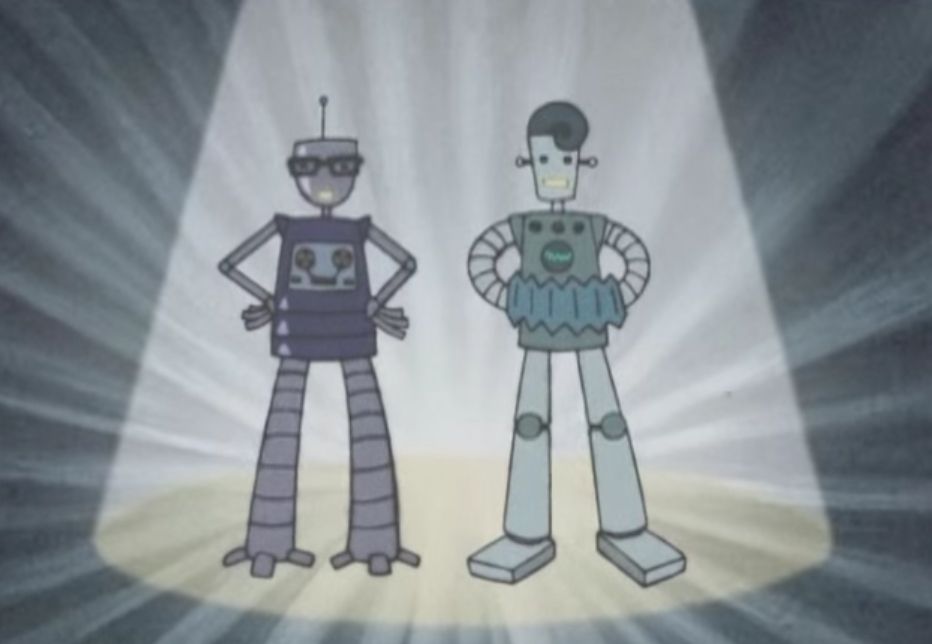
Stated to be "twelve feet tall": another Giants joke. It pretty much goes down the generic cameo checklist: thick glasses, floppy hair, apocryphal concertina. My favorite part is probably the tapedeck in robo-JF's chest. It looks like a happy little face.
(video)
Resemblance: 6/10
Adorability: 8/10
Grotesquerie: 2/10
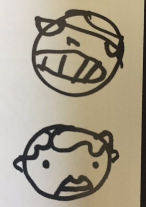
Found on one of the mid-2000s setlists featured in Rock/Rinse/Repeat, these caricatures are drawn by none other than John Flansburgh himself! His self-portrait has been rendered rather abstract by years of using it as an element of his signature (though this one has a nose).
JF's has a lot in common with Hine's stop-motion puppet, but pulls his signature chompy tooth-bared expression. His depiction of Linnell is the rarer, more fun part: we have the curly hair swoop, the mouth crease, and prominent ears... I can hardly disagree.
One thing that I find missing from this list: the Flansbeard! Surely, now in the 2020s, it will have become mainstream enough to the TMBG image to get some representation. We shall see.